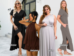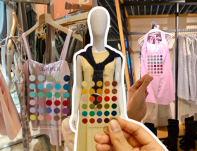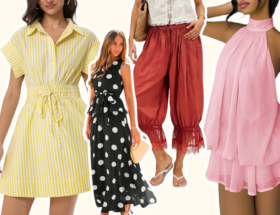
Once you know your personal color season, mixing colors becomes far less risky than it seems, because every color in your palette already shares the same undertone. That shared foundation is what makes combinations feel intentional rather than random, but a few principles make the difference between colors that simply don’t clash and colors that actually enhance each other.
Why Your Palette Mixes More Easily Than Random Colors
Color clash usually comes from mismatched undertones, one color pulling warm while another pulls cool, even if both are technically “pretty” on their own. Since every color in your season’s palette shares the same underlying temperature, most combinations from within it avoid that clash automatically. This is the core advantage of shopping and dressing from a defined palette rather than an unlimited color wheel.
Match Intensity, Not Just Color Family
Beyond undertone, chroma matters just as much. Pairing a soft, muted color with a highly saturated one from the same palette can still feel slightly off, even though both technically belong to your season. As a general rule, colors with a similar level of intensity tend to combine more smoothly than colors from opposite ends of your palette’s saturation range.
Three Reliable Mixing Approaches
- Analogous mixing. Combine colors that sit close together in tone, like two warm earth tones for an Autumn, or two cool blue-based shades for a Winter. This creates a calm, cohesive look.
- Deliberate contrast mixing. Pair a light color with a deep one, or a neutral with a saturated accent, matched to your season’s natural contrast level. This creates energy without breaking the palette.
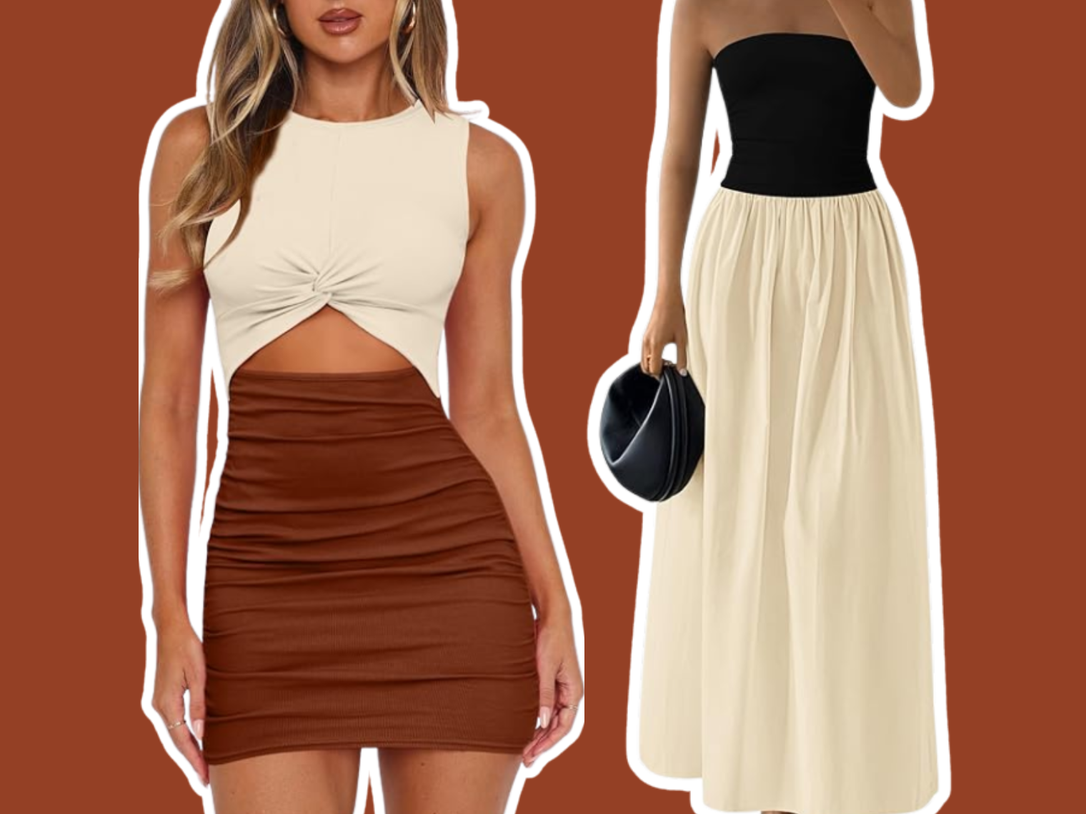
- Tonal mixing. Layer multiple shades of the same color family, several depths of one hue, for a look that reads as polished with almost no risk of clashing.
Use a Neutral as an Anchor
When combining two or more bolder colors feels risky, anchoring them with a shared neutral, the same top, bag, or shoe color, gives the eye a consistent resting point. This is a particularly useful technique for mixing two accent colors that might otherwise compete for attention.
Mixing Across Sub-Seasons
If you’re a specific sub-season, like Warm Spring, you can generally mix confidently within the broader Spring palette too, since neighboring sub-seasons still share your core temperature. The safest mixing happens within your own sub-season’s specific shades, but borrowing a color from an adjacent sub-season rarely causes a real clash, it simply shifts the overall intensity of the combination slightly.
Mixing Prints and Patterns
The same undertone logic applies to prints. A pattern where the dominant colors fall within your season’s palette will generally mix well with solid pieces from that same palette. A print with even one strongly off-season color running through it can be harder to incorporate, since that single clashing thread pulls against everything else.
Common Mixing Mistakes
- Combining opposite-intensity colors. A very muted shade and a very saturated shade from the same season can still feel mismatched together.
- Overlooking metals as part of the mix. Jewelry and hardware color counts as part of the overall color combination, not just fabric.
- Mixing too many colors at once. Even within one palette, three or more non-neutral colors in a single outfit can start to feel busy.
Key Takeaways
- Colors within your season’s palette mix more easily because they share the same undertone.
- Matching intensity, not just color family, is key to combinations that feel intentional.
- Analogous, contrast, and tonal mixing are three reliable approaches within any palette.
- A shared neutral can anchor two bolder colors that might otherwise compete.
Frequently Asked Questions
Yes, that’s one of the most reliable combinations, since both share your season’s undertone, just at different intensities.
Occasionally, especially in small doses like a single accessory, but it’s more likely to disrupt the cohesion of an otherwise well-matched combination.
If they blend together with little visual distinction, adding a neutral or a slight value difference usually creates enough separation.
The same undertone and intensity-matching principles apply to any color combination, including decor, though this guide focuses on clothing.
Where to Go From Here
For outfit-specific formulas, see our guide to How to Create Outfits Using Your Seasonal Palette. And for the broader wardrobe framework this fits into, see How to Build a Wardrobe Using Your Personal Color Palette.
If you haven’t confirmed your season yet, our free Personal Color Analysis, powered by AI, identifies your exact palette in minutes.