
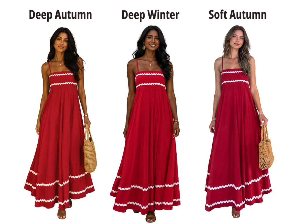
Two people can both wear “red” and look completely different, because a single color name covers dozens of distinct versions, each with its own temperature, value, and chroma. Personal color analysis identifies which specific version of a color harmonizes with your coloring, not just which color family to reach for.
The Same Color, Many Versions
“Red” isn’t one shade. It’s a whole family: blue-based reds, orange-based reds, deep wine reds, bright clear reds, soft muted brick reds. Each version sits at a different point across temperature, value, and chroma, which is exactly why “wear red, it’s a classic” is incomplete advice. The real question is always which version of red.
How Temperature Changes a Color’s Version
A blue-based red and an orange-based red are both unmistakably “red,” yet they behave in opposite directions on cool versus warm coloring. This kind of shift, where hue stays constant but the color still reads differently depending on its base, is part of the principle of color harmony: a color reads as harmonious or competing based on its relationship to what surrounds it, not on the color alone.
How Value and Chroma Change a Color’s Version
Temperature isn’t the only thing that shifts. A clear, bright red and a deep, muted brick red share a similar temperature but sit at very different points on the value and chroma spectrum. One suits lighter, more vivid coloring; the other suits deeper, more muted coloring. This is why two people who are both, say, warm-toned can still reach for entirely different versions of red and both be right for their own coloring.
A Concrete Example
Picture a Bright Winter and a Soft Autumn, both trying “red.” The Bright Winter is enhanced by a true, clear, high-contrast red, sharp and vivid enough to match their naturally high-clarity coloring. The Soft Autumn is enhanced by a muted, brick-toned red, softer and more blended, matching their naturally gentle, earthy coloring. Both are wearing “red.” Neither is wearing the other’s red.
Why This Matters When Shopping
This is exactly why buying “the color that worked on a friend” so often disappoints. Your friend’s flattering red and your flattering red might share a name and nothing else. Once you know your own temperature, value, and chroma, you can shop for the specific version of a color that’s actually built for your coloring, rather than the color family in general.
Practical Application
- When a color “doesn’t work” despite being in your general palette, check whether it’s the right version, same hue, wrong value or chroma is a common, fixable mismatch.
- When shopping from a recommendation, look for the specific undertone and depth described, not just the color name. “Red” alone isn’t enough information to shop from.
- When comparing yourself to someone else’s “best color,” remember you may need an entirely different version of that same color family, not the identical shade.
Common Mistakes
- Assuming a flattering color transfers exactly to another person. The color family might transfer; the specific version usually needs to change.
- Shopping by color name alone. “Coral,” “red,” and “blue” each span a wide range of temperature, value, and chroma.
- Giving up on a color family too early. If one version of a color didn’t work, a different version within the same family might.
Key Takeaways
- A single color name, like red or blue, covers many distinct versions that differ in temperature, value, and chroma.
- Two people can both suit “the same color” while actually wearing very different specific shades.
- Matching the right version of a color matters as much as choosing the right color family.
- Knowing your own temperature, value, and chroma lets you shop for the specific version built for you.
Frequently Asked Questions
In a sense, yes, most color families include some version that works for most people. The goal isn’t avoiding a color entirely, it’s finding the specific version that harmonizes with your coloring.
Start with your known temperature, value, and chroma, then look for a version of that color matching all three, rather than the first example of that color you find.
Dye lots, fabric finish, and lighting can all shift how a color reads slightly, which is one more reason “the same color” can behave differently even on the same person.
It’s related but broader. Undertone (temperature) explains part of the shift, value and chroma explain the rest, together they explain why a color name alone isn’t a reliable shopping guide.
Where to Go From Here
This same principle is part of a bigger idea: colors don’t just vary in versions, they actively shape how your whole appearance reads. Our guide to How Colors Affect Your Overall Appearance goes deeper into that effect.
And if you’d like the exact version of your favorite colors identified for your coloring, our free Personal Color Analysis, powered by AI, does exactly that.